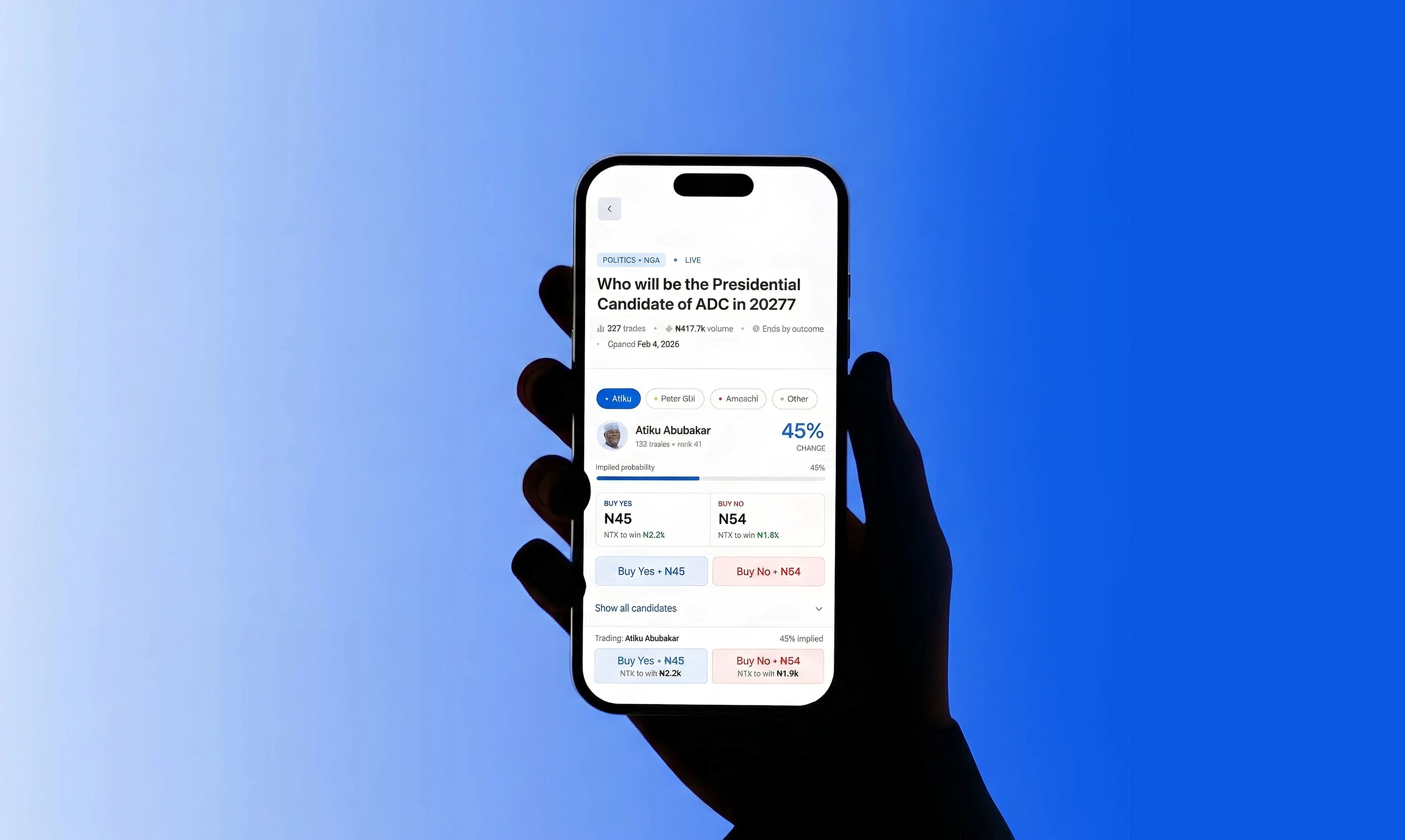
Bayse Markets
Multi-Market Detail Redesign
View Live Project
Project Overview
Bayse Markets is a Nigerian prediction markets platform where users trade on real-world outcomes across politics, sports, finance, and entertainment. As the platform scales and onboards users who are new to prediction markets, the multi-market detail screen — where users evaluate candidates and place trades needed to do more heavy lifting.
The existing screen didn't surface enough context for confident decision-making. Probability signals were purely numeric, payout potential was hidden until late in the flow, and comparing candidates in a multi-outcome market meant scrolling through stacked cards.
I redesigned the multi-market detail page to reduce friction in placing an order, making it easier for any user to understand the odds, see what they stand to win, and act on a candidate without second-guessing.

Challenge & Background
Prediction markets let people trade on real-world outcomes — buy "Yes" or "No" shares where market price reflects implied probability.
In Nigeria, these markets face two unique challenges. First, liquidity when not enough traders are active, the spread widens and users lose value before the outcome happens. Second, trust markets need to resolve fairly, and Nigerian information sources are often contested. The 2023 INEC election dispute is a clear example: platforms like Bet9ja and NairaBet have voided markets over similarly unclear outcomes. Most platforms don't define resolution criteria tightly enough upfront, which directly informed my design decisions around surfacing resolution rules prominently.
The existing multi-market detail page didn't give users enough context to trade confidently. Probability was raw numbers requiring mental math, payout potential wasn't visible until deep in the flow, and comparing 4+ candidates meant scrolling through stacked cards. The challenge was to redesign this page so users could evaluate candidates, understand risk, and place a trade with minimal friction.

Goals & Constraints
Goals
Reduce steps between landing on a market and placing a trade
Make implied probability visually scannable without mental math
Surface payout info ("₦1k to win ₦2.2k") at the point of decision
Enable fast candidate comparison without scrolling
Keep the trade action accessible via persistent sticky CTA
Surface resolution rules prominently to build trust
Constraints:
Working within Bayse's existing design system
Mobile-first — majority of Nigerian users trade on phones
Multi-outcome markets (4+ candidates) must stay manageable on small screens
Assessment timeline limited user research and testing
Compromise:
No live user testing — decisions informed by domain research and UX best practices
Focused on a single market type (politics, 4 candidates) as the primary case
Analytics and post-trade engagement flows deferred
Portfolio tracking designed for web only, not mobile
Team & Role
Solo product designer — research, UX strategy, interaction design, visual design, and prototyping across mobile and web.
Process: Research, Design, Testing
Research: With a fixed assessment timeline, I focused on deep domain research rather than primary user research. I analyzed prediction market mechanics, how prices reflect probability, how liquidity affects trading, and how AMMs solve thin-market problems. This research directly shaped my design: prominent resolution rules, visual probability bars, and payout previews at the decision point.
Design Process: Seven design decisions, each addressing a specific friction point:
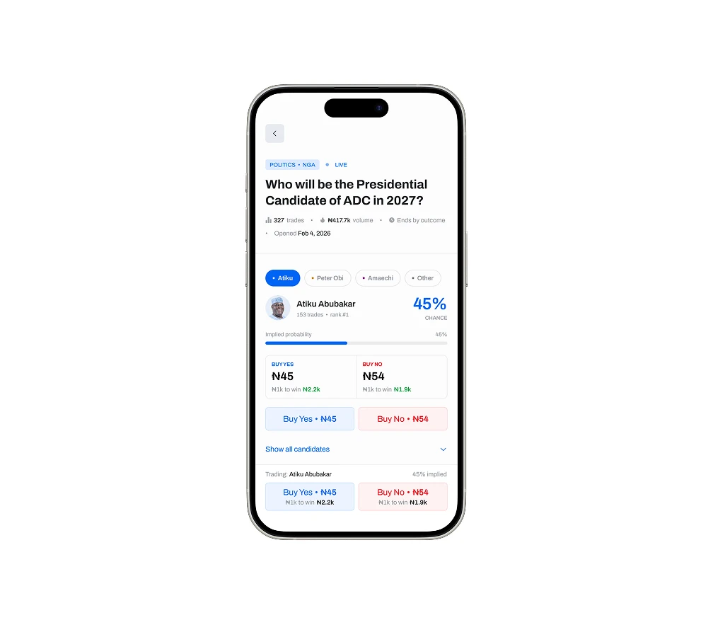
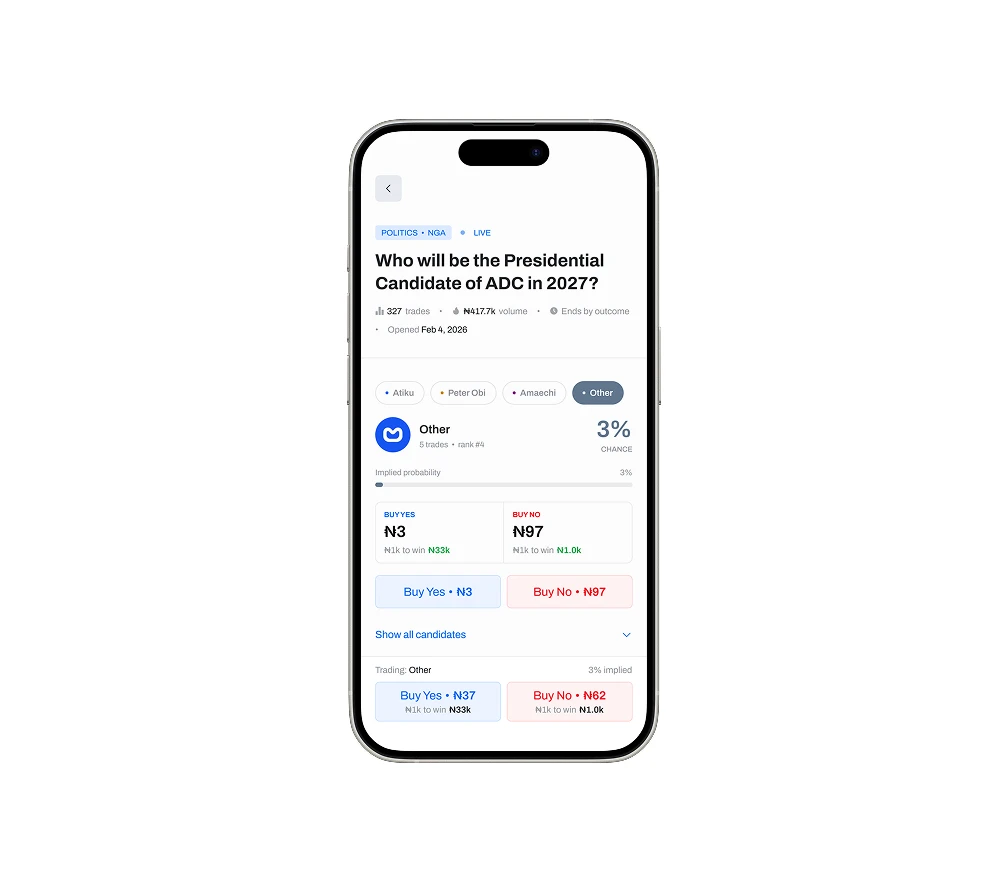
Market summary at a glance — category, live status, trade count, volume, and open date in one scannable header strip.
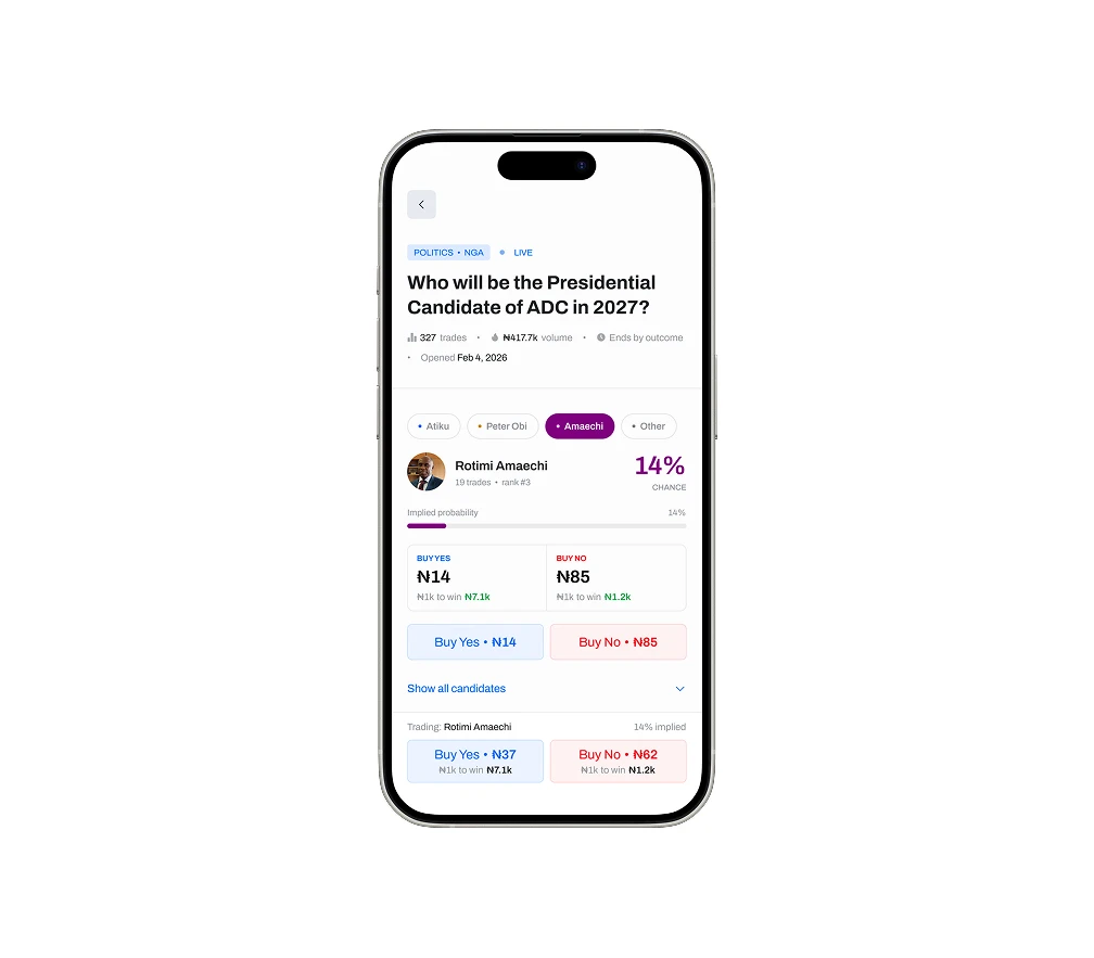
Visual probability bars — implied probability readable without calculation, reducing cognitive load vs. numeric-only displays.
Payout preview at point of decision — "₦1k to win ₦2.2k" shown before committing, on both the candidate card and sticky button.
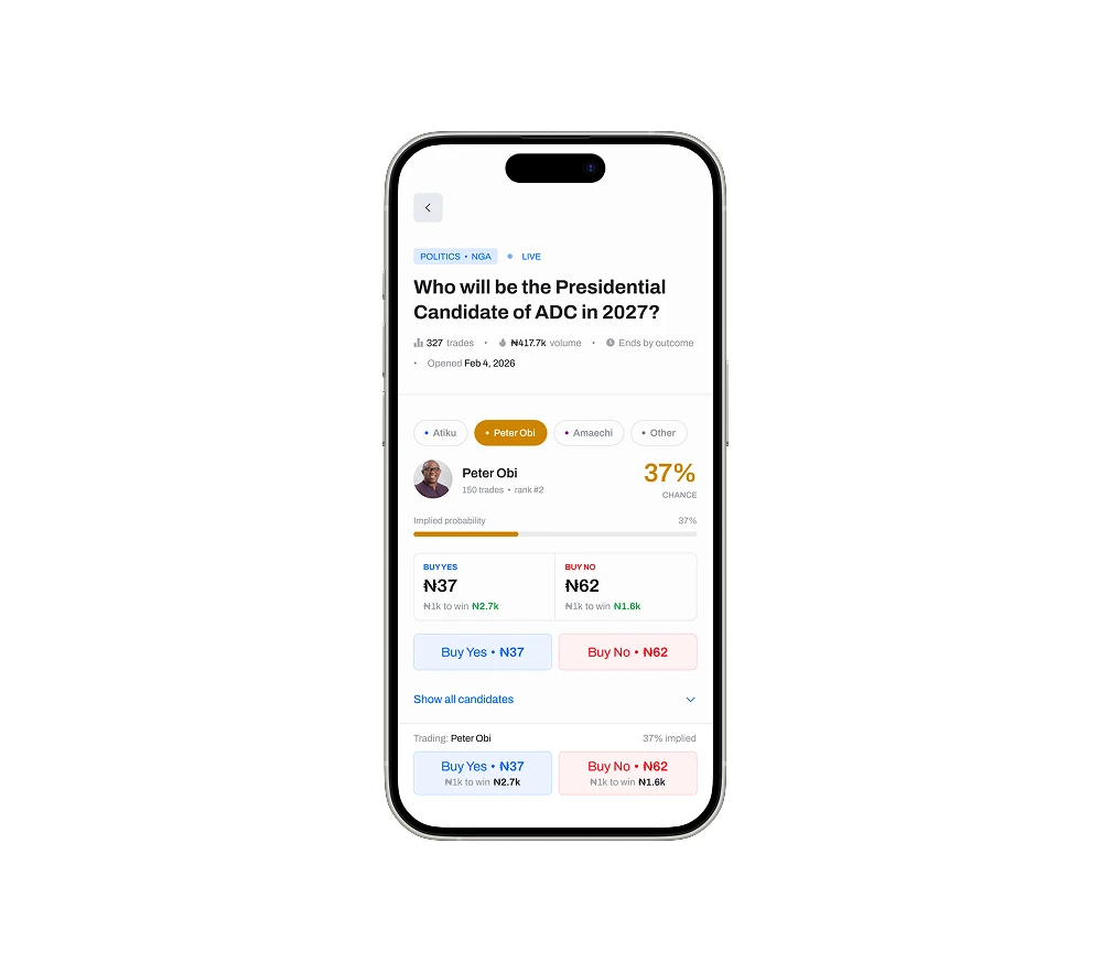
Candidate pill switcher — horizontal tabs for instant comparison without scrolling through stacked cards.
Sticky trade button — persists while scrolling with live context (candidate name, probability, Buy Yes / Buy No).
Structured accordions — Resolution Rules and Timeline & Payout as collapsible sections instead of flat text.
Candidates surfaced top and center — trade section appears immediately after the market title, before supporting information.
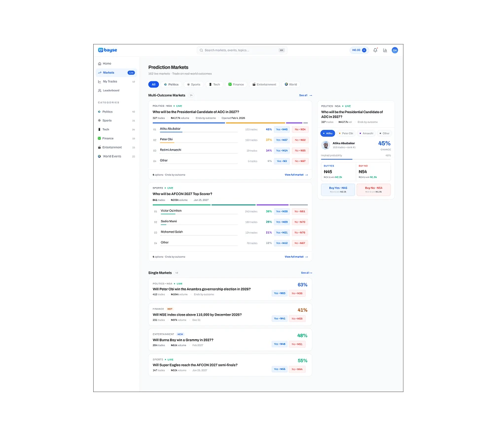
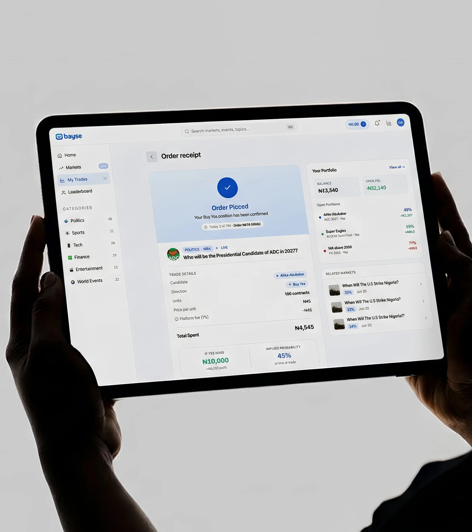
Extended the design to web with a Markets overview and Order Receipt screen.
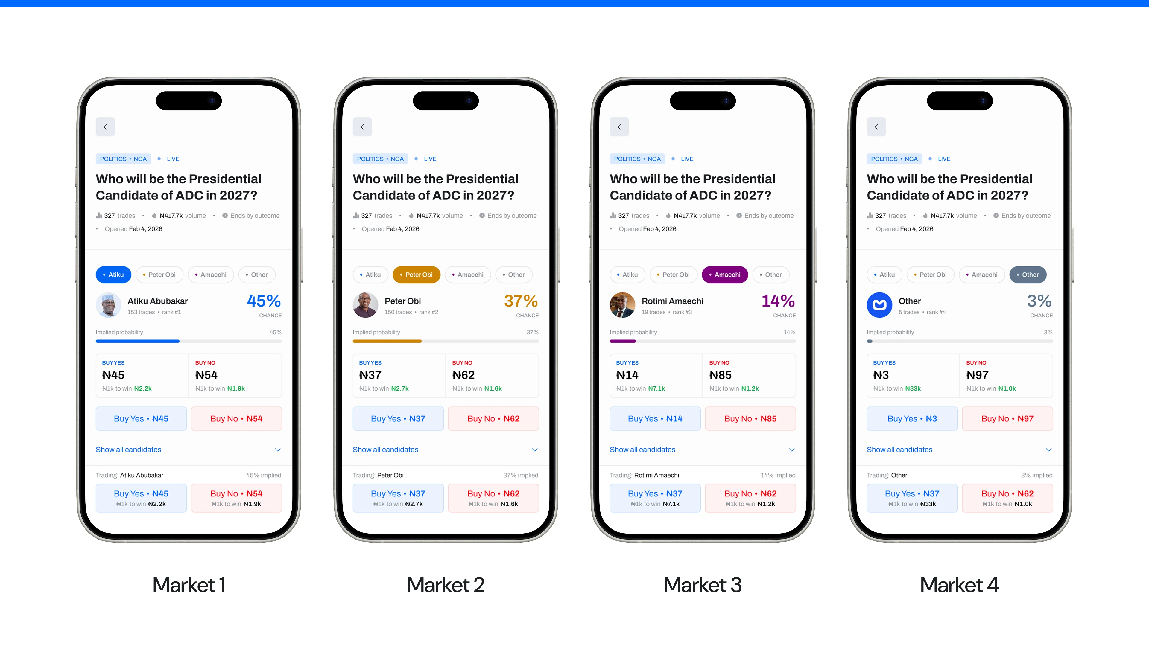
Testing & Handoff: Delivered a Figma prototype covering the full mobile trading flow with four candidate states (45%, 37%, 14%, 3%). Web version includes a Markets listing page and Order Receipt with trade confirmation and portfolio summary.
Next steps: usability testing with Bayse traders, A/B testing the sticky CTA, and testing with first-time users to validate payout previews.
MVP Features
MVP Features:
Candidate pill tabs for instant multi-outcome comparison
Implied probability visualization bar
Payout preview on candidate card and sticky CTA
Persistent sticky trade button with live context during scroll
Market summary header with category, status, volume, and date
Accordion sections for Resolution Rules and Timeline & Payout
Current odds leaderboard ranking all candidates
Price history chart with time filters and multi-candidate trends
Web Markets overview with multi-outcome and single-market sections
Web Order Receipt with trade details, payout projection, and portfolio sidebar
Final UI Designs

Steps to trade
Payout visibility
Market comparison
Learnings
Trust and transparency mattered more than visual polish. In a market where platforms have voided outcomes before, surfacing resolution rules prominently — not in fine print — is what builds trading confidence.
Progressive disclosure worked well for multi-outcome markets. The pill switcher turned a scrolling problem into a tapping one — clean interface, all candidates instantly accessible.
Showing payout potential at the exact decision point does double duty — helps users manage risk and gives them a reason to act. Even one scroll between that info and the trade button creates unnecessary friction.
Designing for Nigerian prediction markets required more than adapting a Polymarket-style interface. Local trust dynamics, contested information sources, and behavioural patterns from sports betting all had to inform the UX.
Previous project
Next project