VFD Microfinance Bank
Rebuilding the home screen around what people actually do
View Live Project
Project Overview
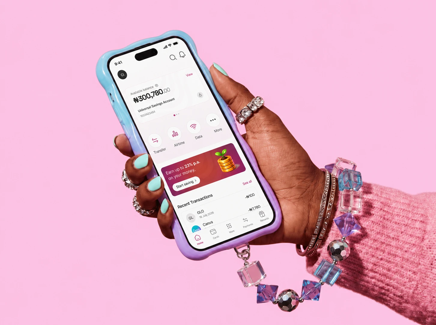
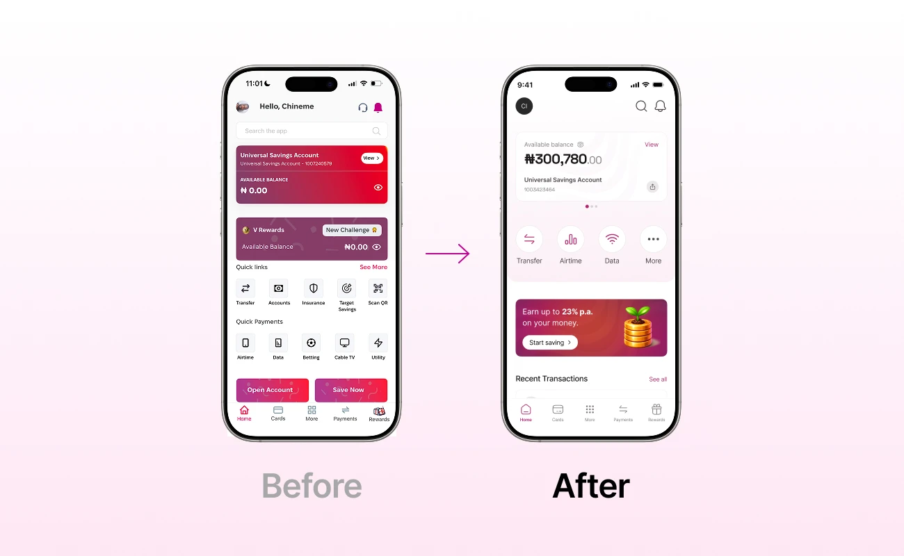
VFD Microfinance Bank's retail home screen had grown crowded with too many competing elements, savings scattered across five entry points, and the most common tasks buried below the fold. Working from a realistic current-state screen, I rebuilt the home into clear zones so frequent tasks (airtime, data) get their speed while the products the bank wants to grow (savings) get their weight, without the two fighting for the same spot.
Challenge & Background
Background
The brief listed Savings as the top priority, but usage told a different story: Airtime and Data are what people actually open the app to do. Savings matters because it drives revenue; Airtime and Data matter because they're the daily habit. The existing screen tried to serve both by stacking everything — which buried the frequent tasks and slowed the app down.
Challenge |
Goals & Constraints
Make the most frequent tasks (airtime, data) reachable in a single tap; give Savings enough visual weight to still command the screen; strip out clutter and duplicate elements.
VFD's existing brand system and magenta palette; mobile first, thumb-reach layout; worked from a realistic current-state screen rather than a blank canvas.
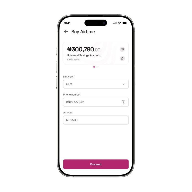
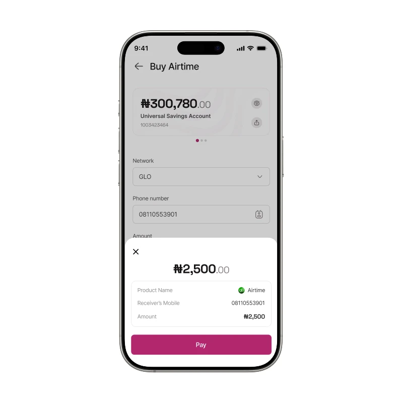

No live usability testing within the assessment window; prototyped one core journey (buying airtime) end to end rather than every flow.
Team & Role
Solo designer responsible for the current-state audit, UX strategy, interaction design, UI, and prototyping. Completed as a design assessment for VFD MFB.
Process: Research, Design, Testing
Audited the current-state home screen against the brief and real usage patterns. The key insight: the brief's stated priority (Savings) and the actual daily behaviour (Airtime and Data) were in tension so the redesign couldn't just rank one below the other in a single list.
1. Split priority from position — Savings earns attention through how it looks; frequent tasks earn speed through where they sit.
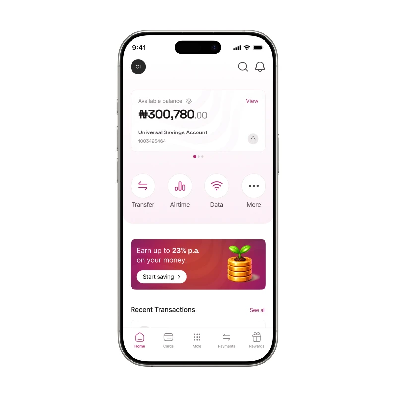
2. Rebuilt the screen in zones, each with one job: Balance → Quick actions → Savings → Recent transactions.
3. Cut one of the two balance cards (Rewards already lives in the bottom nav).
4. Moved Airtime and Data into the top action row, one tap from home.
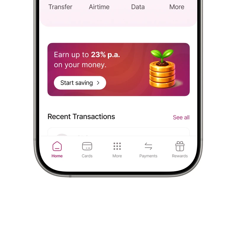
5. Collapsed five scattered savings entry points into a single card.
6. Used one gradient — only on the savings card with neutrals carrying the layout and magenta marking only what's tappable.
Delivered an interactive Figma prototype of the core airtime journey. Next step would be usability testing with real retail users to validate task speed.
MVP Features
Single account balance card; one-tap quick-action row (Transfer, Airtime, Data, More); consolidated savings card carrying the full brand gradient; recent transactions for quick confirmation; end-to-end airtime purchase flow with confirm sheet, PIN sheet, and shareable receipt.
Final UI Designs
Airtime access
Savings entry points
Balance cards
Learnings
When a brief's stated priority conflicts with real user behaviour, you don't have to choose; you can separate priority from position, letting one product win on visual weight and the other on placement. Contrast is itself a prioritisation tool: when almost everything on a screen is calm, the single bold element reads as the priority without needing the top slot. And consolidating scattered entry points, five savings doors into one, concentrates attention instead of diluting it.
Previous project
Next project